











Garden Furniture Color Selection: How to Create an Outdoor Palette?
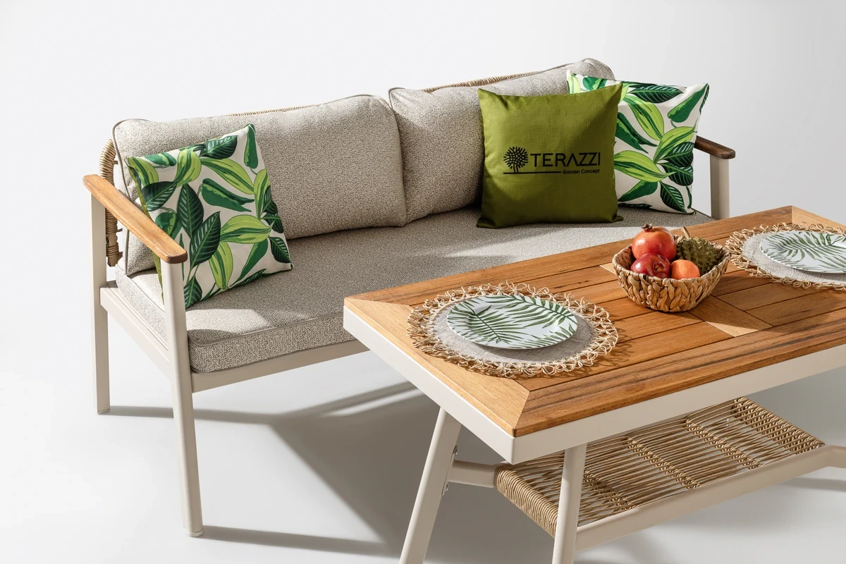
A cushion that looks light beige in a showroom may appear almost white under midday sun. An anthracite armrest that looks balanced in the shade may become much warmer than expected on a terrace exposed to direct sunlight for hours. How furniture looks outdoors is determined less by a color chart and more by the flooring, facade orientation, duration of shade, and surface materials.
For this reason, starting the color selection directly with the sofa or seating set can be misleading. The flooring and facade should be evaluated first, followed by the frame and cushion tones. This prevents the furniture from disappearing into the floor visually or looking as if it was added to the space later.
The Floor Already Defines the First Color in the Palette
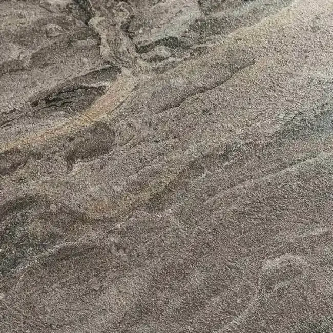
The largest color surface in a garden or terrace is usually ceramic tile, natural stone, concrete, or wooden decking. When furniture has the same level of brightness as the floor, the legs, armrests, and outer edges may become visually unclear. On the other hand, creating too much contrast can make the furniture look disconnected from the surrounding space.
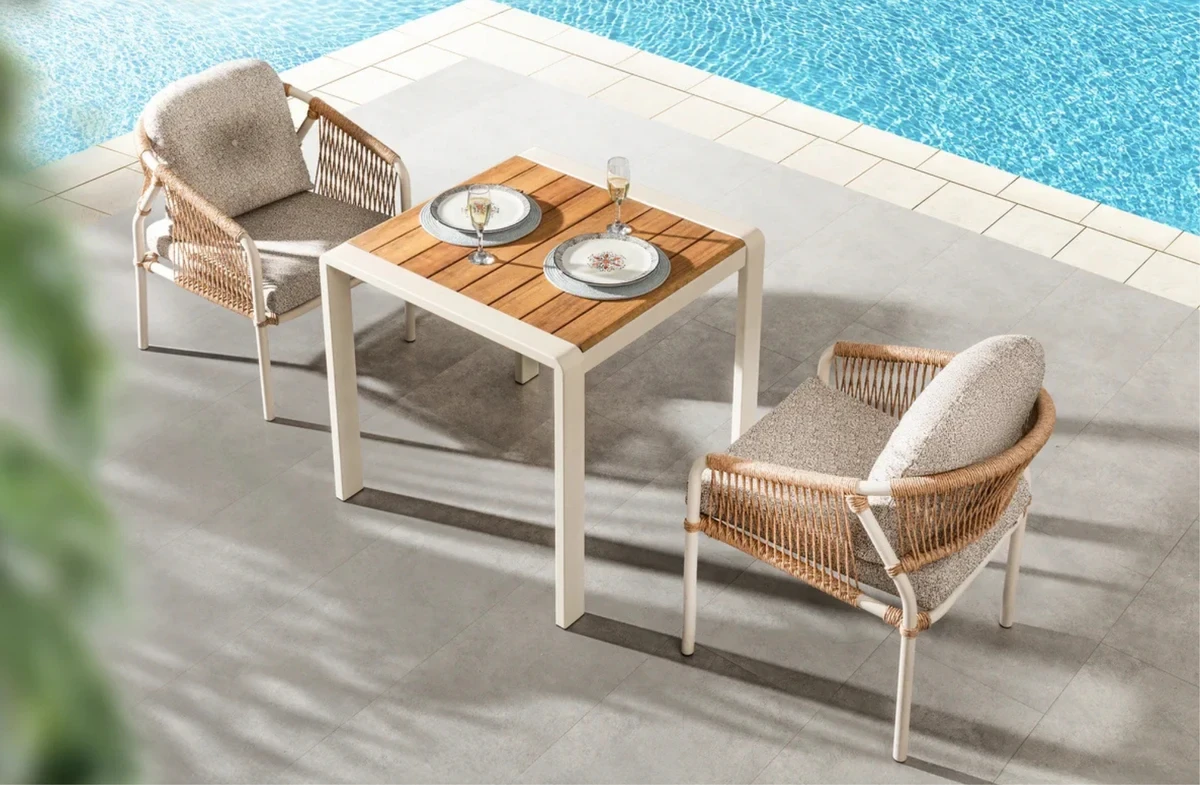
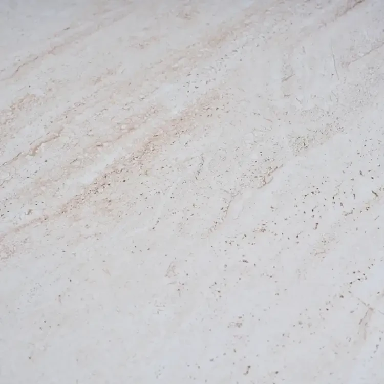
Cream and beige stone floors coordinate easily with iroko, cappuccino, sand, and off-white tones. However, choosing every element in the same level of brightness is not ideal. Leaving a few tonal differences between the frame, cushions, and wood helps keep the furniture form visually defined.
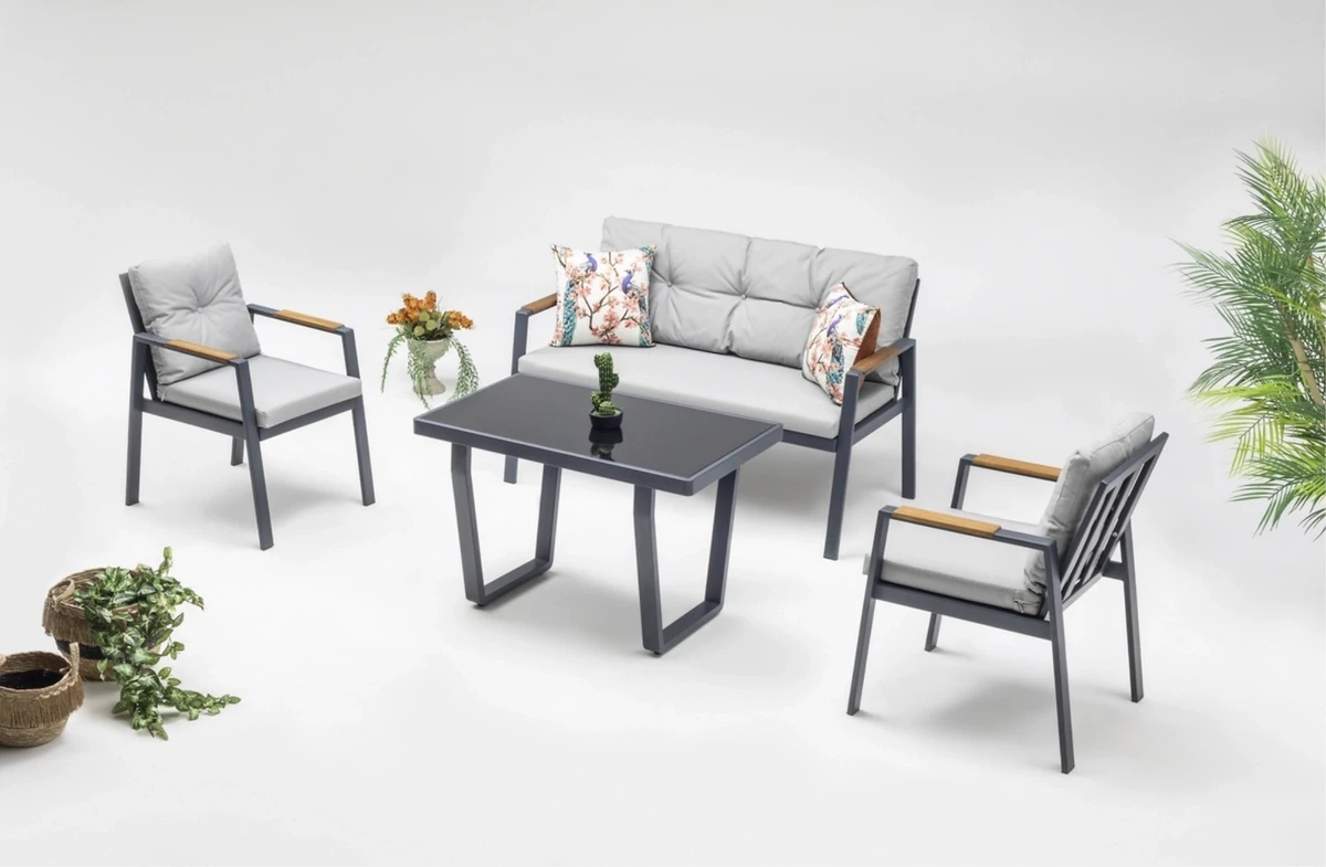
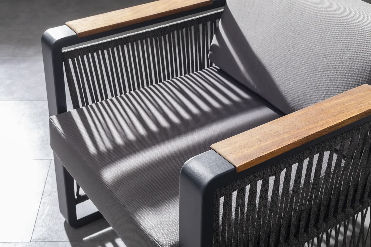
Anthracite can be used with gray ceramic flooring. If the floor is also dark, large anthracite surfaces may make the furniture appear heavier or larger than it actually is. A slim anthracite frame combined with light cushions and limited iroko details creates a lighter visual effect.
In spaces with patterned ceramic flooring or heavily veined natural stone, the furniture should be kept relatively simple. Patterned flooring, dense weaving, and patterned cushions used together can make the space visually crowded. Solid-colored cushions help prevent the furniture from becoming lost within the floor pattern.
Plants and large planters should also be considered part of the color palette. In gardens with dense greenery, choosing all seating surfaces in green may cause the furniture to visually disappear into the plants. Repeating the same green tone in a few cushions or ceramic accessories is usually sufficient.
Why Does the Same Color Look Different in the Morning, Noon, and Evening?
An east-facing balcony receives warm, bright light in the morning. On a west-facing terrace, colors become more intense in the afternoon. Toward sunset, yellow and orange reflections increase. On north-facing areas, gray, blue, and cool white tones may appear more muted.
Fabric and metal samples viewed under indoor showroom lighting do not always represent how they will look outdoors. A cushion that appears light beige in the morning may look almost white at midday. In the evening, it may reflect nearby wood and greenery and appear warmer.
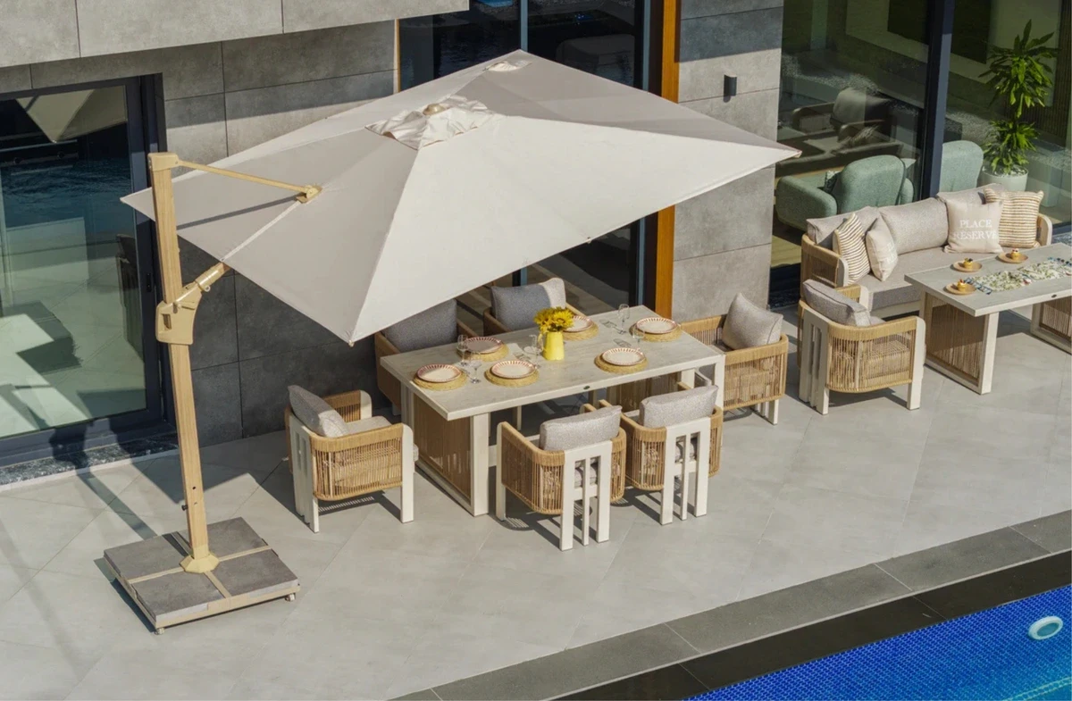
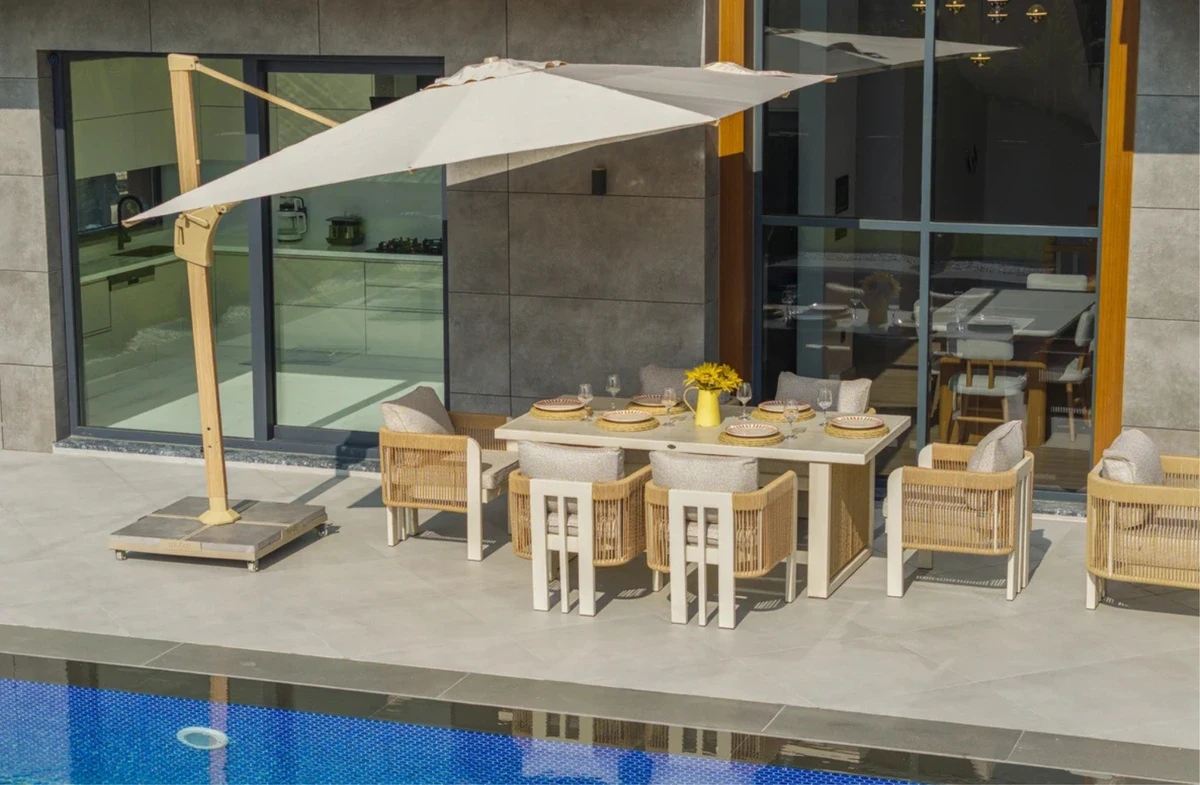
If the area does not remain consistently shaded throughout the day, parasols should also be included in the color plan. Cushion and frame colors beneath the umbrella may appear darker than surfaces receiving direct sunlight.
Sunlight also changes surface temperature. Dark colors can absorb more heat than lighter shades when exposed to direct sun. The amount of temperature difference depends on the material, surface coating, airflow, and duration of sun exposure.
There is no need to avoid anthracite completely on south- or west-facing areas. Dark tones can be used on slim frames, while lighter or medium shades can be preferred on contact surfaces such as seats, backrests, and armrests.
Our Recommendation: Product images on phone screens can vary according to screen brightness and photography lighting. Compare fabric, metal, and wood samples on the actual flooring where the furniture will be used, both in direct sunlight and in shade.
How Matte Metal, Iroko, and Woven Surfaces Affect Color
The same color code does not look identical on every material. Matte-painted aluminum appears flatter and more uniform. Iroko wood contains light and dark variations in its grain, while the shadows created between rope and rattan weaving can make the same color appear darker in certain areas.
The Effect of Anthracite Depends on How Much Surface It Covers
Anthracite used on a slim aluminum profile acts almost like an outline defining the shape of the furniture. The same tone becomes much more dominant when used on a large tabletop, thick armrest, or solid back panel.
Whether anthracite makes a space feel smaller depends on the amount of surface it covers and the thickness of the profile. Slim dark profiles on light flooring define the furniture clearly. Large anthracite surfaces on dark flooring may make the product appear visually heavier.
The visibility of dirt and water marks also depends on surface color. Light-colored pollen and mineral deposits become more noticeable on dark frames. Food and drink stains are usually more visible on very light cushions.
How Should Iroko Be Combined with Anthracite and Cappuccino?
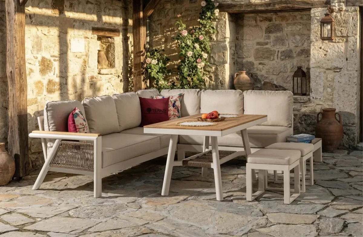
Iroko wood contains yellow-brown and golden tones that create a natural transition between metal frames and textile surfaces. If too many orange, terracotta, and dark brown tones are added around a furniture set with iroko details, the entire space may become concentrated within one warm color family.
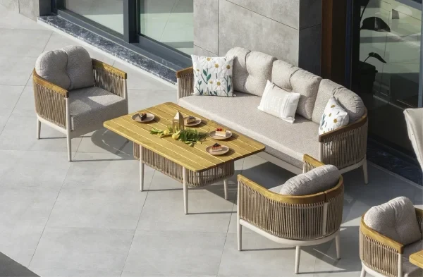
An anthracite frame, iroko armrests, and off-white cushions create a clearer contrast. A cappuccino frame, iroko surface, and sand-colored textiles create a softer tonal transition. The choice should depend on whether the flooring and facade have warm or cool undertones.
The grain structure of iroko can make small surface marks less noticeable than on flat, single-colored materials. Because the tone of wood can change over time, the manufacturer’s recommended maintenance product and application schedule should be followed.
A small iroko armrest detail does not create the same color impact as a large iroko tabletop. For this reason, it is important to consider not only whether wood is used, but also how much of the furniture surface it covers.
How Do Weaving Gaps Affect Dark Colors?
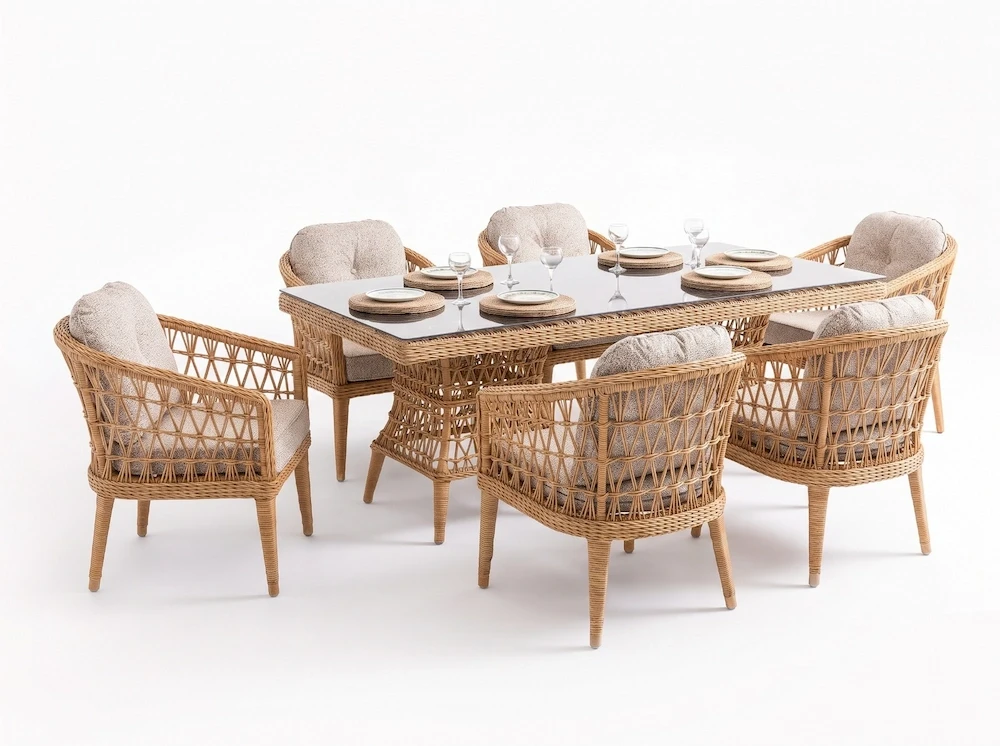
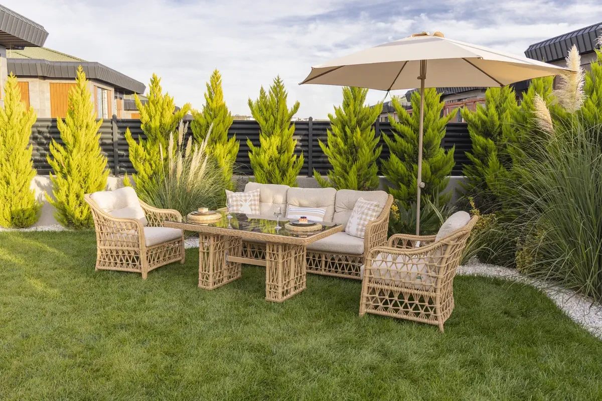
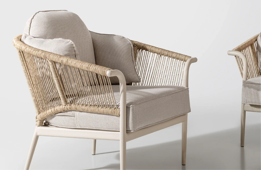
Rope and rattan surfaces do not behave visually like solid panels. Flooring, walls, and plants visible through the gaps can make dark backrests and seating surfaces appear lighter.
Dense, thick weaving creates a stronger block of color. In more open rope applications, the background remains partially visible. Luxio Cord outdoor rope, developed specifically for Terazzi, makes shadow and tonal transitions more visible in hand-woven furniture.
UV resistance and lightfastness are two different properties in synthetic rattan and outdoor rope. UV resistance relates to how the material physically performs under sunlight, while lightfastness indicates how much the color changes when exposed to light.
For products with rattan surfaces, the suitability of the material for outdoor conditions should be considered alongside weaving density. Our Wintech Rattan page explains how this material is developed to resist UV exposure and color fading.
Material and Color Distribution in Terazzi Products
In Terazzi products, the amount of aluminum, iroko, and woven material used changes how color is perceived across the furniture. In the Minerva Collection, metal frames, wooden details, and Luxio Cord rope are combined, while rattan furniture models create a more fragmented tonal appearance because of their woven surfaces.
Because iroko is the primary material in the Ares Wood model, choosing simpler cushion and accessory tones helps keep the wood grain visible. The Cappuccino and Anthracite options available in the Efes Outdoor Dining Set also demonstrate how the same frame form can look different on light stone, gray ceramic, and wooden flooring.
Slim Profiles on Balconies, Zoned Colors on Terraces
On a narrow balcony, how color is distributed between the frame, cushions, and table is especially important. A completely light-colored furniture set may visually disappear into the floor. Choosing every surface in a dark shade can make the circulation area feel tighter.
Light cushions appear less dominant on small balconies. A slim anthracite frame keeps the furniture edges visually clear. Limited iroko details on armrests or tabletops add warmth without dominating the space.
In areas with limited square footage, mini sets occupy less surface area than large seating groups. Their compact dimensions also reduce the visual impact of dark frame colors on small balconies.
On large terraces, dining, seating, and sunbathing zones can be distinguished using different textile tones. There is no need to use a different frame color for each zone. Keeping the same anthracite or cappuccino frame throughout and changing only the cushion colors can create a more organized look.
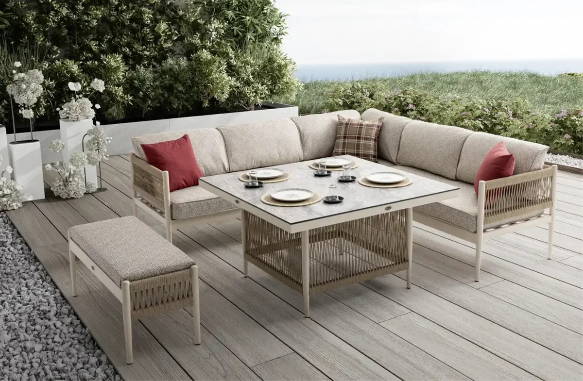
If corner sets are used in the seating zone, color distribution should be evaluated across a larger surface than with individual armchairs. Dark cushions on the long back and seating surfaces of an L-shaped unit can occupy a substantial part of the terrace visually.
Very light cushions in dining areas show stains more quickly. Dried water marks may be more noticeable on dark, smooth tabletops. Medium-toned fabrics and textured surfaces usually make minor marks less visible.
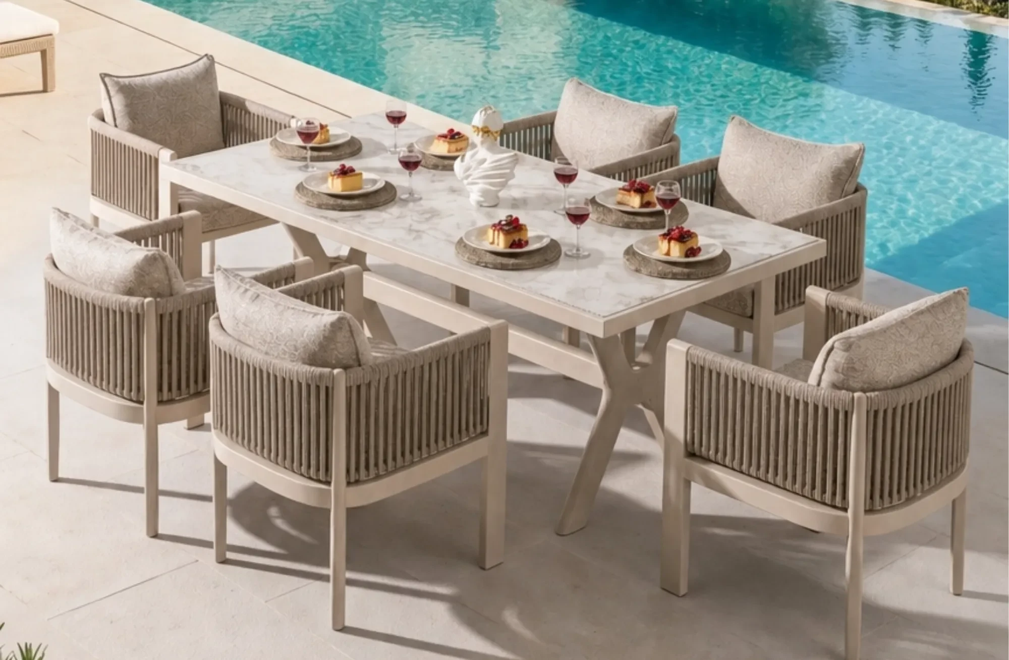
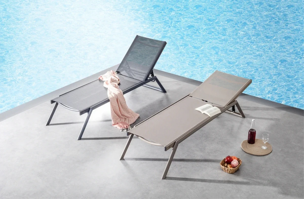
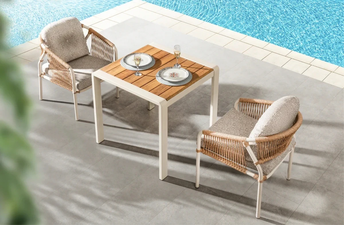
The blue of the swimming pool is already a strong part of the palette. Instead of adding another blue to the furniture, light gray, sand, iroko, and anthracite tones can be used.
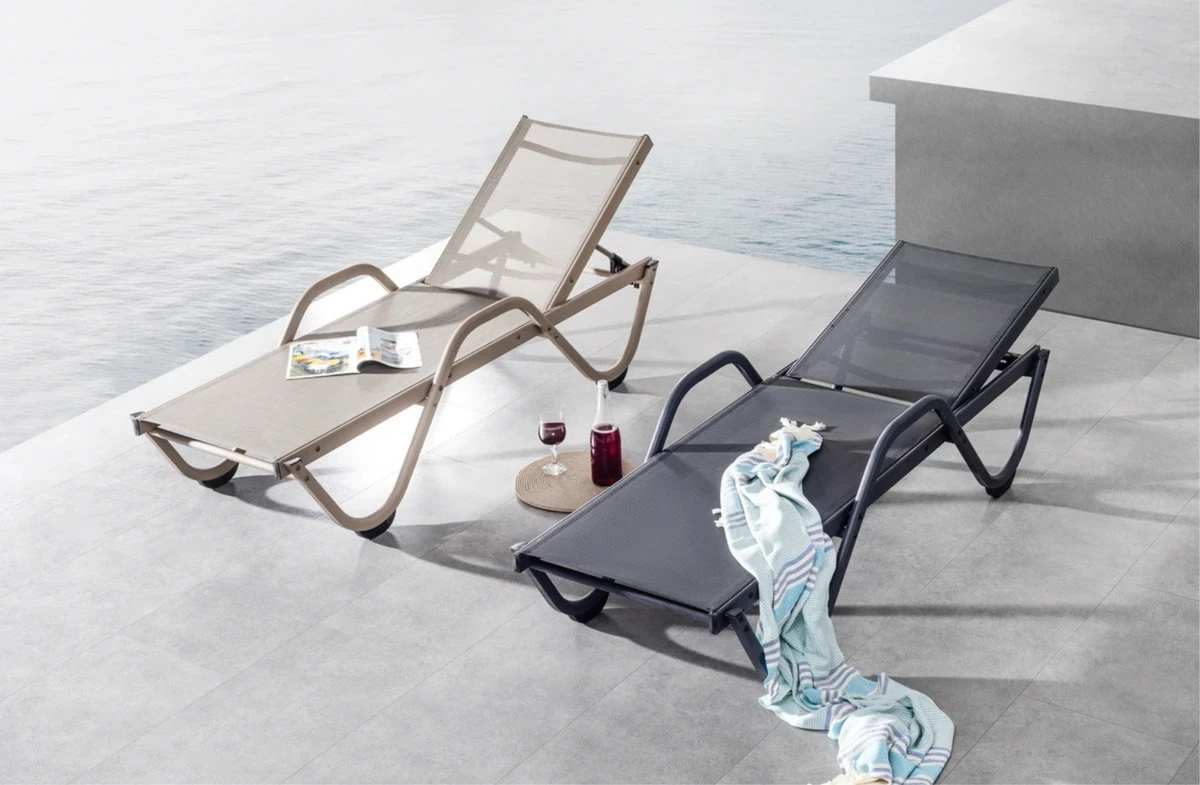
For poolside furniture, drying performance is just as important as color. Phifertex mesh fabric, with its PVC-coated polyester structure and quick-drying characteristics, is used in outdoor products that frequently come into contact with water.
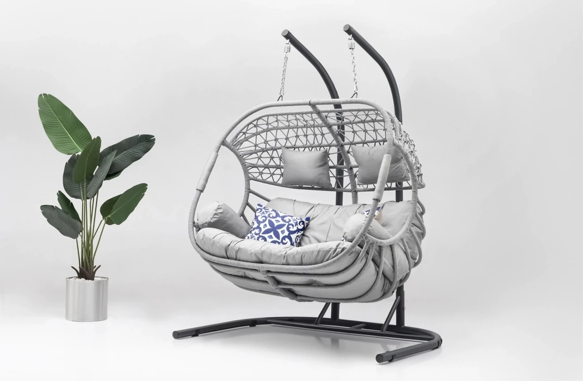
On an outdoor swing positioned away from the main seating area, repeating one of the existing frame or cushion tones helps prevent the swing from looking disconnected from the rest of the garden.
Light Stone, Gray Ceramic, Small Balcony, and Poolside Palettes
In the following four common scenarios, colors can be distributed as shown below. The ratio of light and dark surfaces should be adjusted according to the existing flooring, facade, and plant colors.
Light Stone Flooring
Frame: Anthracite
Cushions: Off-white or light stone
Wood: Iroko
Accent: Olive green
The dark frame separates the furniture from the light flooring. Iroko softens the contrast between anthracite and off-white.
Gray Ceramic Terrace
Frame: Cappuccino
Cushions: Sand
Supporting tone: Off-white
Accent: Terracotta
Cappuccino and sand tones soften the cool appearance of gray flooring. Terracotta remains balanced when limited to a few cushions or planters.
Small Balcony
Frame: Slim anthracite profile
Cushions: Light gray
Wood: Limited iroko detail
Accent: Sage green
Light gray cushions appear less dominant than dark surfaces on a small balcony. The dark frame prevents the furniture from visually blending into the floor.
Poolside Area
Frame: Light gray or anthracite
Mesh or cushions: Sand
Supporting surface: Natural wood
Accent: Dark green
The blue of the pool remains the main accent color. Instead of introducing another blue through the furniture, colors from surrounding stone and vegetation can be repeated.
Evaluate the Product on the Actual Surface Where It Will Be Used
Two colors that appear compatible on a sample card may look different because of the actual flooring and outdoor light conditions. Before placing an order, consider the following:
Identify whether the floor has warm or cool undertones.
Observe the area in morning, midday, and evening light.
Compare metal, wood, and fabric samples on the same flooring.
Maintain a visible tonal difference between furniture legs and the floor.
Consider how many hours dark armrests and tabletops will receive direct sunlight.
Ask separately about fabric UV resistance and lightfastness.
Check whether cushion covers are removable.
Consider local conditions such as pollen, food stains, hard-water marks, and pool use.
Use seasonal colors on replaceable accessories rather than on large furniture pieces.
Furniture positioned near steps, pool edges, or high-traffic areas should remain visually distinguishable from the flooring. Clearly visible furniture legs and seating boundaries can support safer movement in spaces used by children or older adults.
Frequently Asked Questions About Outdoor Furniture Color Selection
What cushion colors work with anthracite outdoor furniture?
Off-white, stone, light gray, gray, and anthracite shades can all be combined with an anthracite frame. In areas exposed to intense sunlight, lighter or medium tones are generally more comfortable on large contact surfaces such as seats, backrests, and armrests.
Can dark-colored furniture be used on small balconies?
Yes. Dark tones can work well on small balconies when used on slim frames or limited surfaces. Light cushions reduce visual heaviness, while a dark frame keeps the furniture from blending into the floor.
What outdoor furniture colors work with gray flooring?
Anthracite, cappuccino, iroko, and warm beige tones work well with light gray flooring. If the floor is dark gray, lighter cushions or wooden details can create better separation between the furniture and the floor.
How can color fading in outdoor fabrics be reduced?
Check both UV resistance and lightfastness specifications, and keep unused cushions away from direct sunlight whenever possible. Following the manufacturer’s washing and cleaning instructions can also reduce the risk of premature color changes.
What colors work well with iroko wood?
Iroko pairs well with anthracite, off-white, light gray, sand, and khaki tones. Because the wood grain already creates a visually active surface, it usually does not require many additional warm accent colors around it.


-
 Turn Your Balcony into a Winter Garden with Garden Furniture: Step by Step Guide
16 August 2026 -
 Features of Iroko Groups in Wooden Garden and Balcony Furniture
16 August 2026 -
 What is Aluminum Garden and Balcony Furniture?
16 August 2026 -
 What is Rope Knitted Garden Furniture?
16 August 2026 -
 Outdoor Lighting and Furniture: How to Create the Right Balance
16 August 2026 -
 Outdoor Furniture Cleaning Guide: How to Keep It Looking Like New
16 August 2026 -
 Outdoor Seating Layout Guide for Large Terraces
16 August 2026 -
 Why Is Aluminum Preferred for Outdoor Furniture?
16 August 2026 -
 Villa Garden Decoration Ideas and 2026 Design Trends
16 August 2026 -
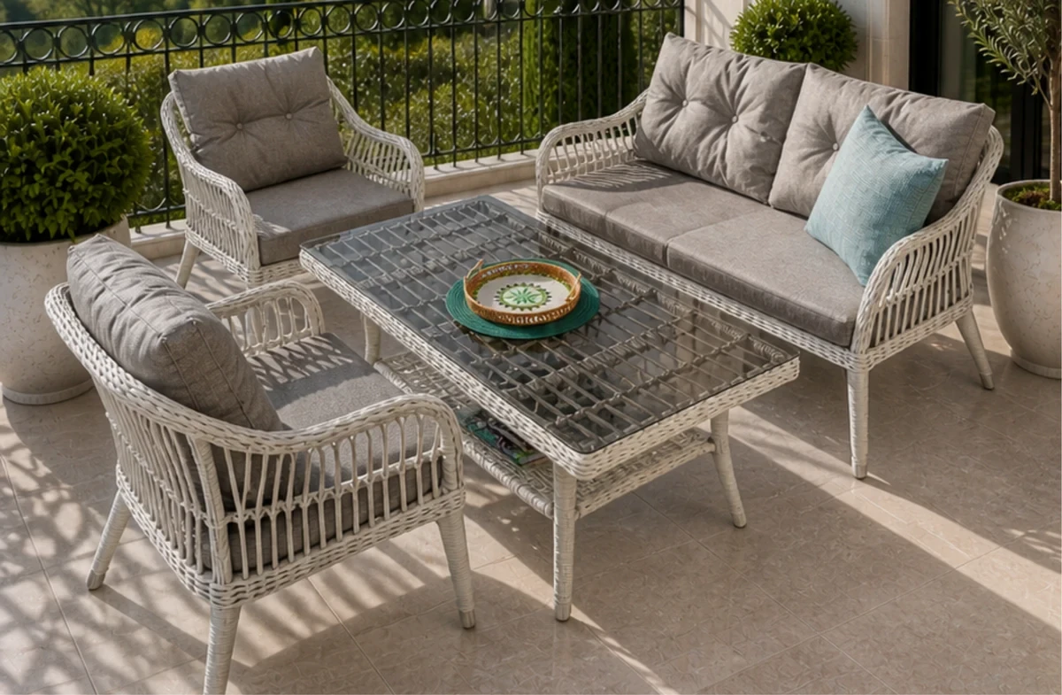 Choosing Outdoor Furniture for Hotels and Restaurants
16 August 2026 -
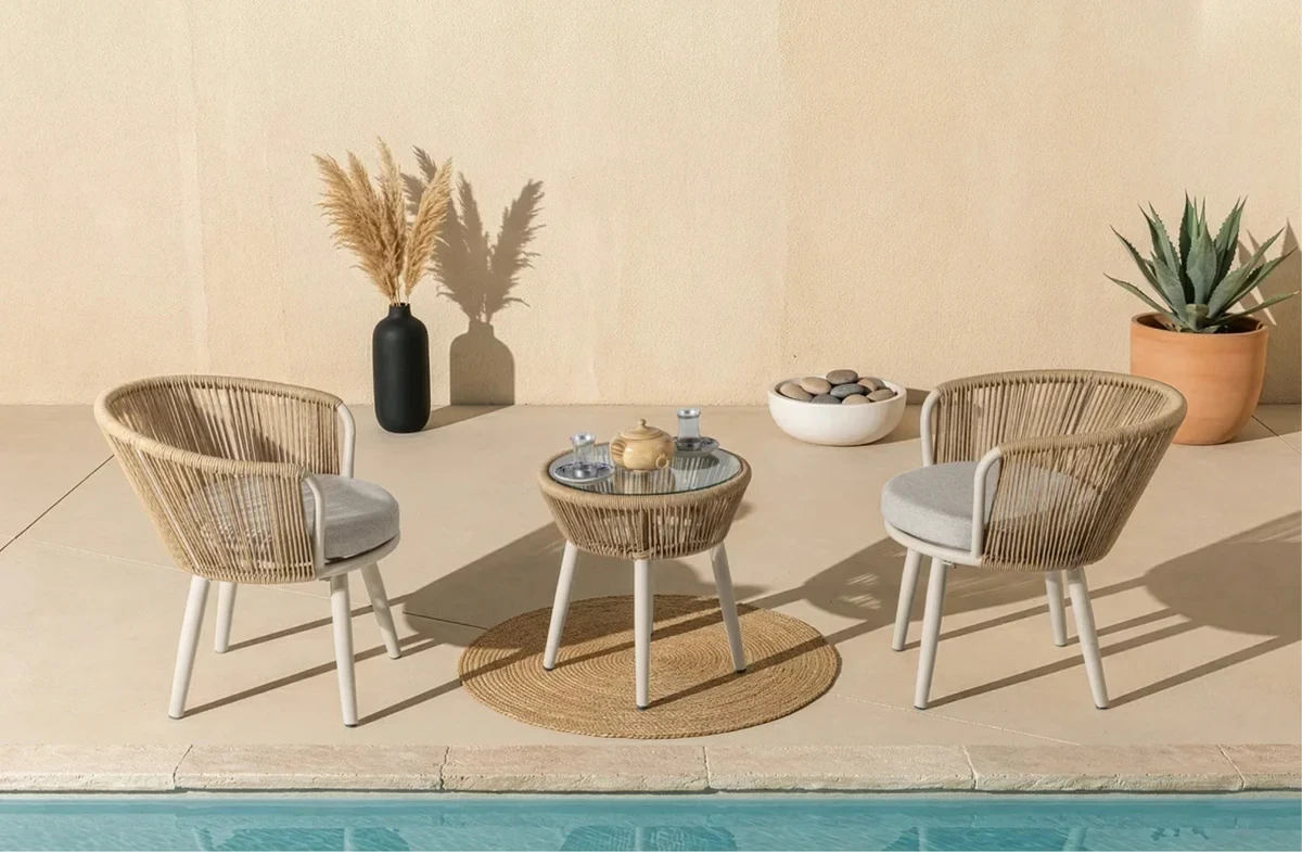 Decorating Ideas for Small Balconies: A Guide to Measurements, Materials, and Placementi
16 August 2026 -
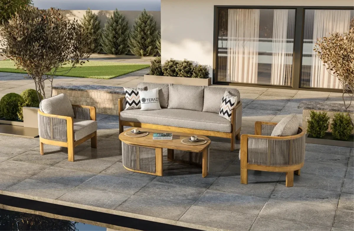 Differences Between Iroko and Teak Wood: Which is More Sensible for Garden Furniture?
16 August 2026 -
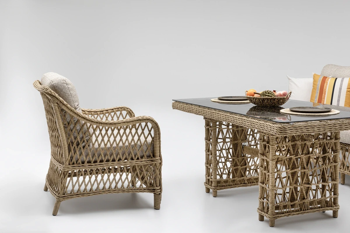 What is the difference between rattan and bamboo furniture?
16 August 2026 -
 What should you pay attention to when choosing a garden or balcony umbrella?
16 August 2026 -
 Cushion and Fabric Choices for Outdoor Furniture: Waterproof, Durable, and Comfortable Options!
16 August 2026 -
 Sun Loungers and Sunbeds: A Comfortable Guide for Poolside Use
16 August 2026 -
 Outdoor Dining Table Dimensions: How Much Space Do You Need?
16 August 2026 -
 2026's Popular Garden Furniture Collections
16 August 2026 -
 Which Garden Furniture Can Stay Outside All Year Round?
16 August 2026 -
 Terazzi Garden Furniture in the TV Series “Muhtemel Aşk”
16 August 2026 -
 Garden Furniture Trends: Sustainable Materials and Recyclable Designs
16 August 2026